You can customize every button in your bot scenario by adding a title, deciding what the button does and what actions are performed in the background.
The button settings are divided into two groups, General Settings that customize the button title and what the button does and Action Settings that can optionally add backend events such as segment users or assign attributes. Both actions and button types are triggered only if the user clicks the button.
General settings
General settings allow limitless customization of the buttons in your bot scenario. For instance, you can create a menu card response that efficiently navigates users through the story. To select a category or a topic, users must only click the right button without typing anything.
To create a functional button you, first you have to name it. Button titles must be unique for each response. The exception is the carousel that accepts the same titles if they occur in different cards.
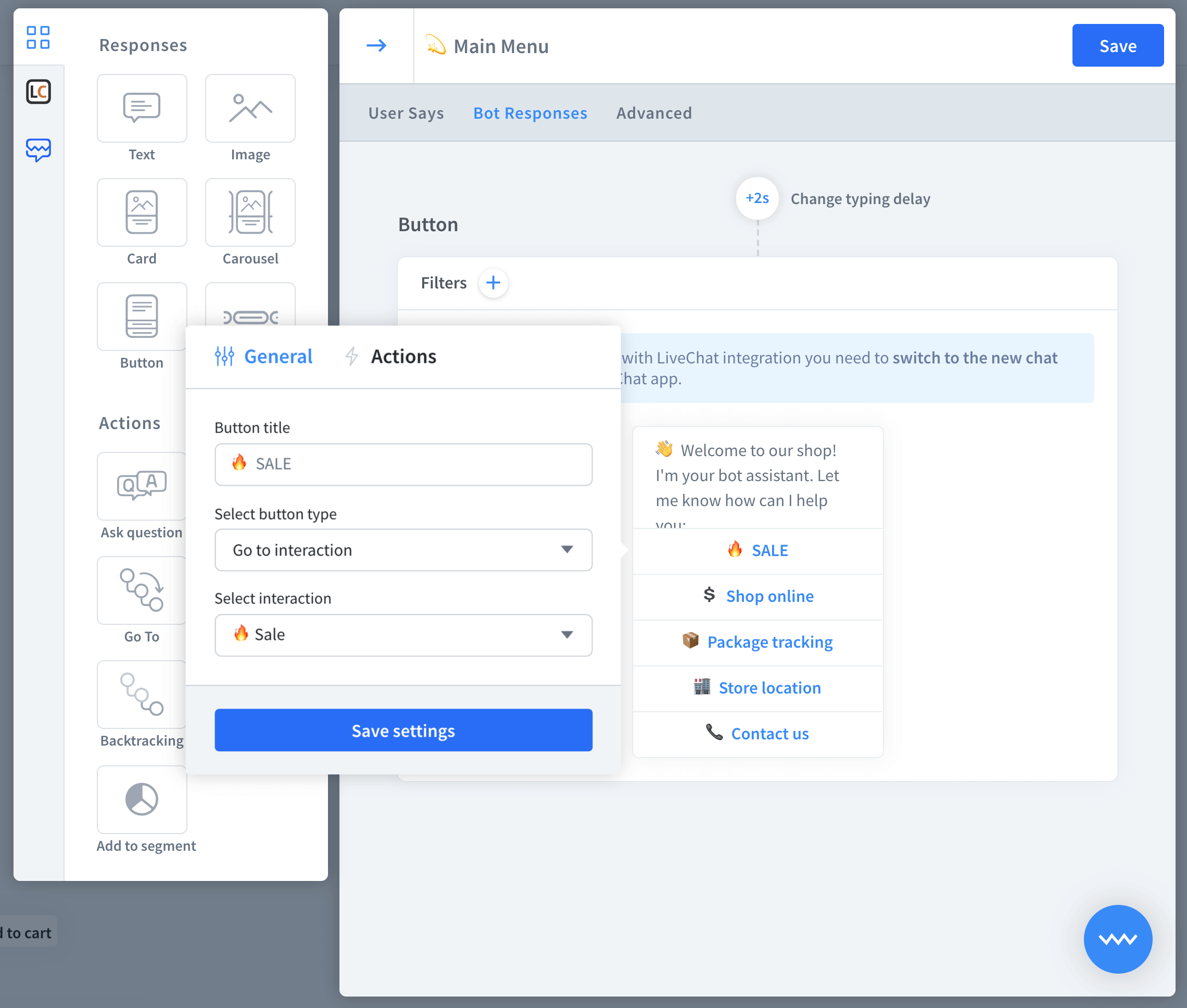 Below the title, you can decide a bot reaction to the click. Here you have five available options:
-
Go To - the bot jumps to an indicated interaction.
-
Postback - define a text that will be treated as if the user wrote it as a query.
-
URL - the bot opens a provided URL in a new tab
-
Phone - the bot dials a defined phone number.
-
Moments ー add a custom Moment to the button.
By default, the button has the type of postback. Leaving the postback field empty treats the title as the user query. You can give your postback a value that will be treated as a user query. However, it won’t be visible to the end-user.
Bot responses that support button types
Button types are available for all bot responses that contain buttons. However, some of the responses don’t support all button types, Check out the table below to be sure that the buttons you plan to create are supported.
Go to | Postback | URL | Phone | Moments | |
|---|---|---|---|---|---|
Card | true | true | true | true | true |
Carousel | true | true | true | true | true |
Buttons | true | true | true | true | true |
Quick replies | true | true | false | false | false |
How to use button types
Before we start, create a simple story with at least one interaction inside.
-
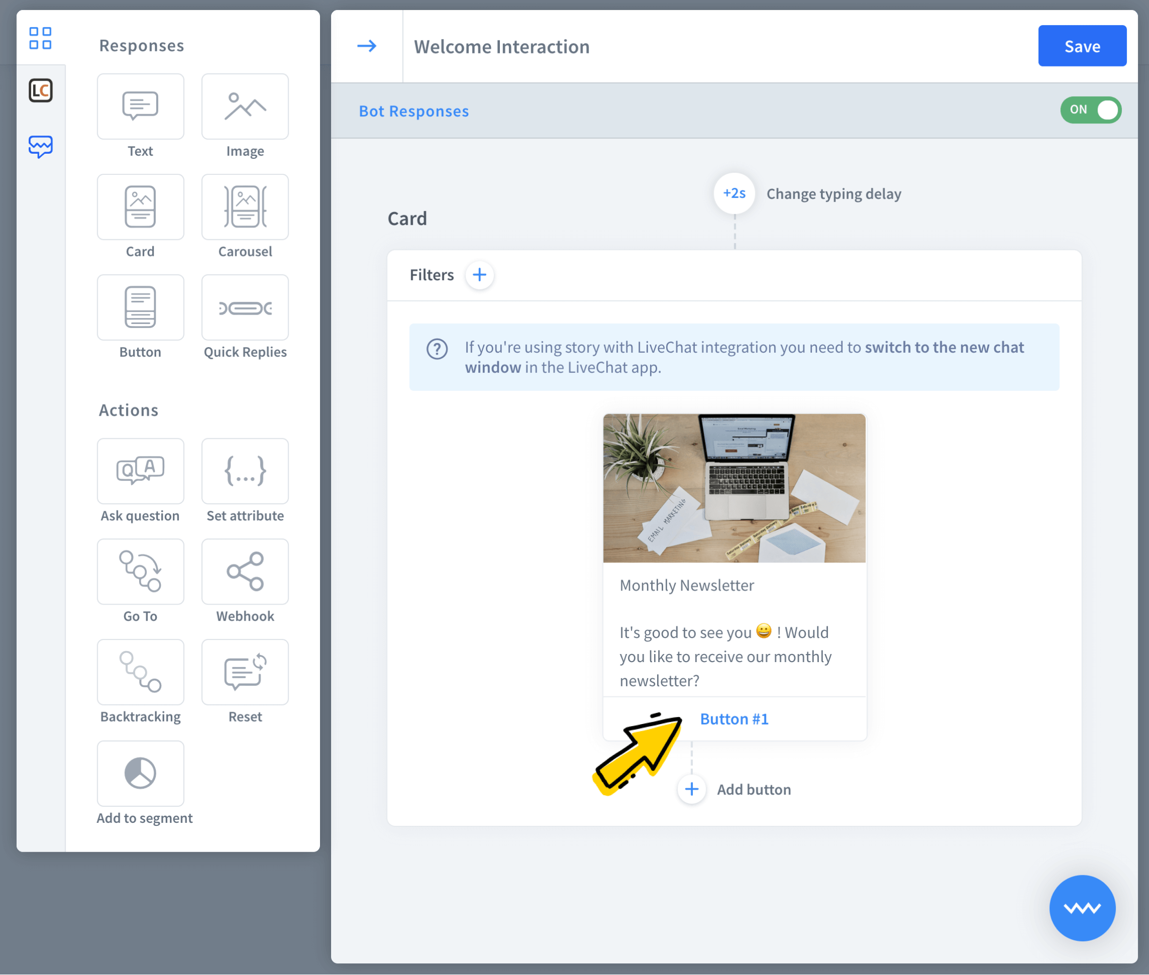
Go to the welcome interaction and add a card response. Click the button to enter the settings.
-
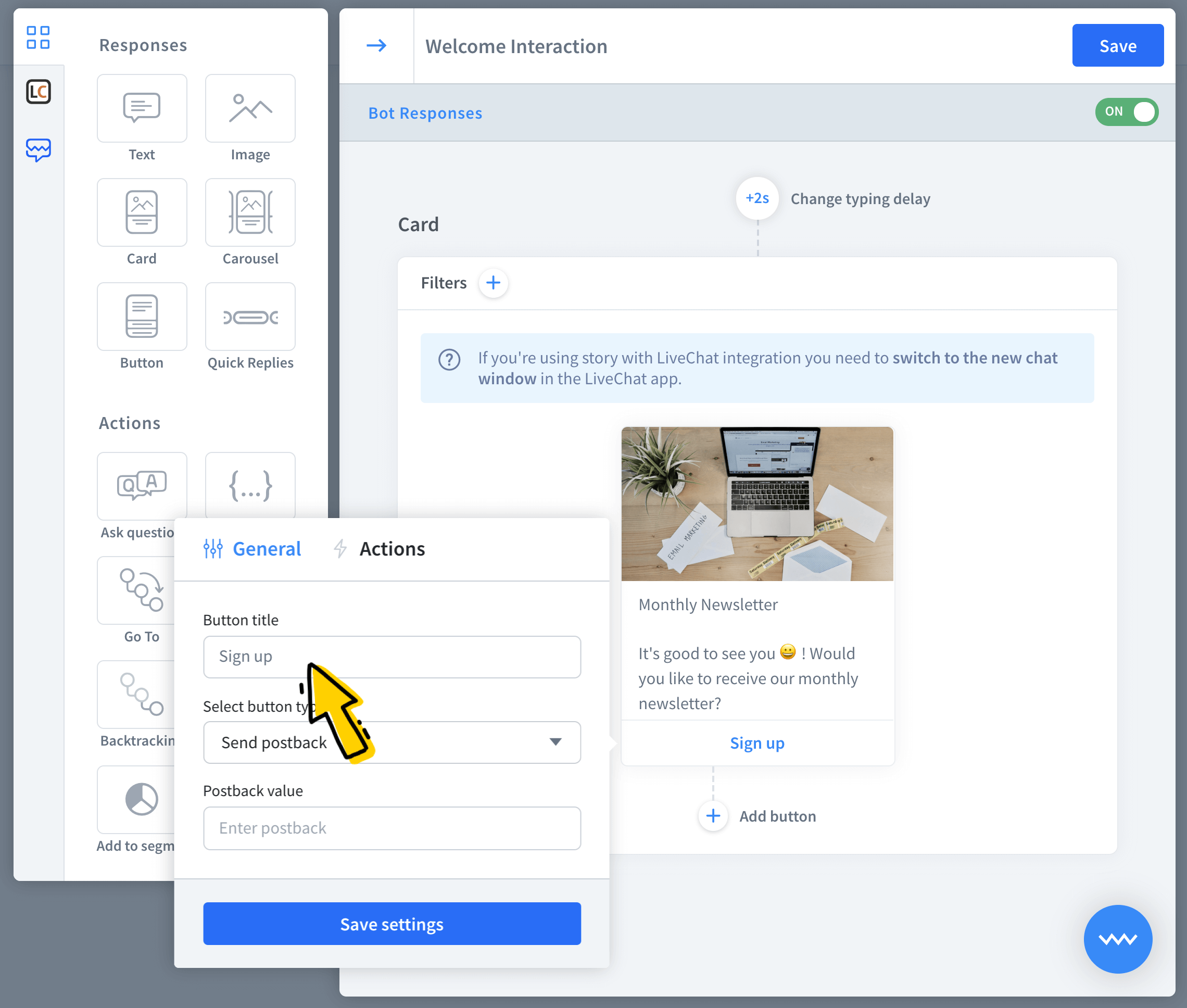
Fill in the required title field. Optionally you can also add an image and a description.
-
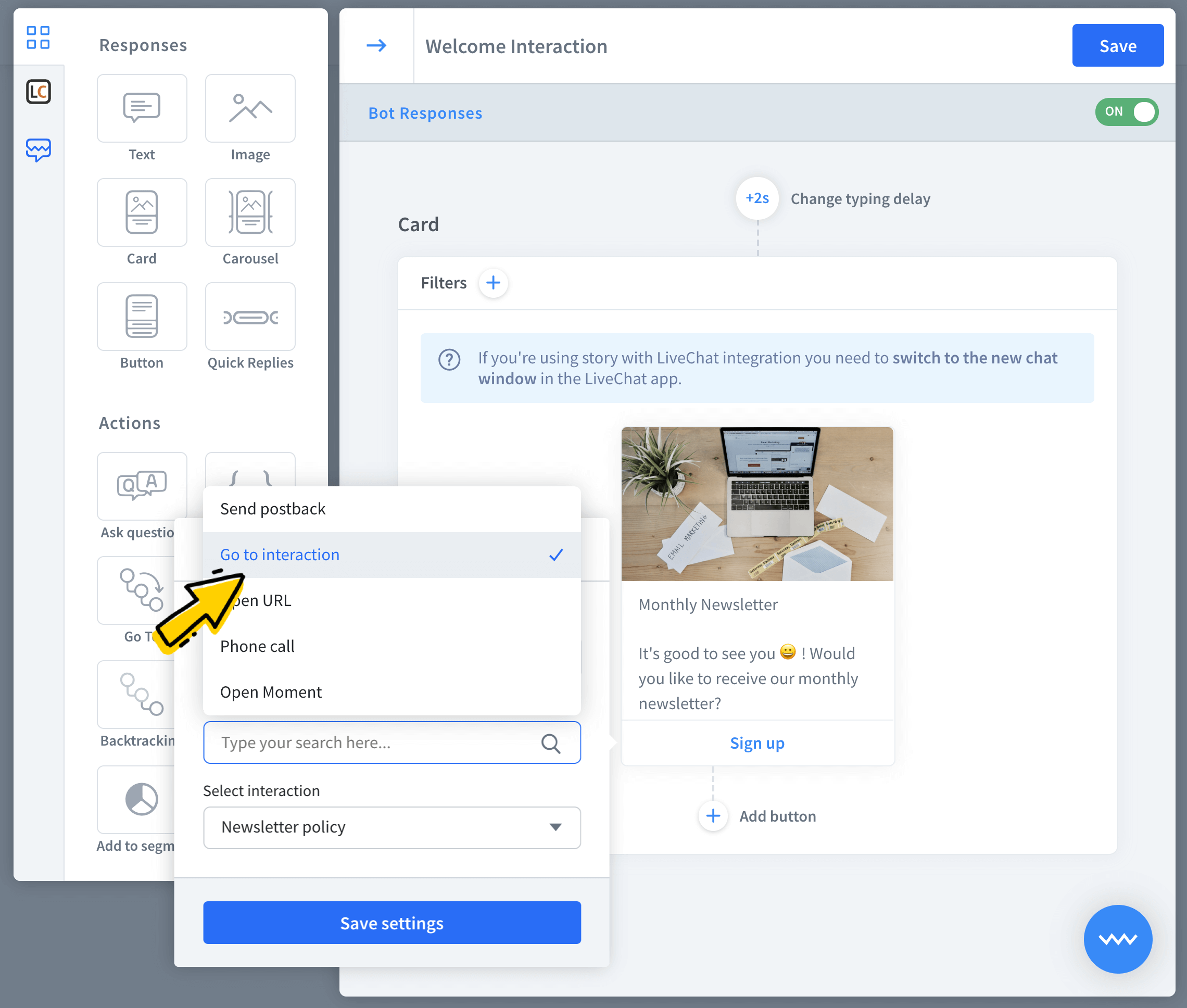
Select go to as a button type.
-
Last but not least, choose a destination interaction for the button.
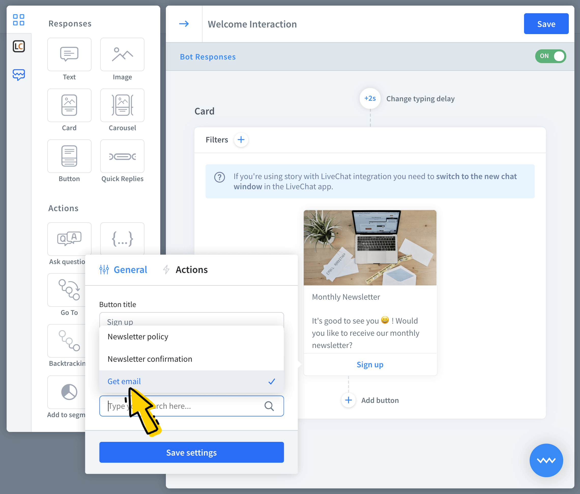
-
Your first button is ready to go. Remember, that you can also add actions to make the button even more powerful.
Actions settings
Actions allow you to add an invisible to the end-users event that triggers when the button is clicked. For example, you can add an action that assigns users that clicked the button to a selected segment.
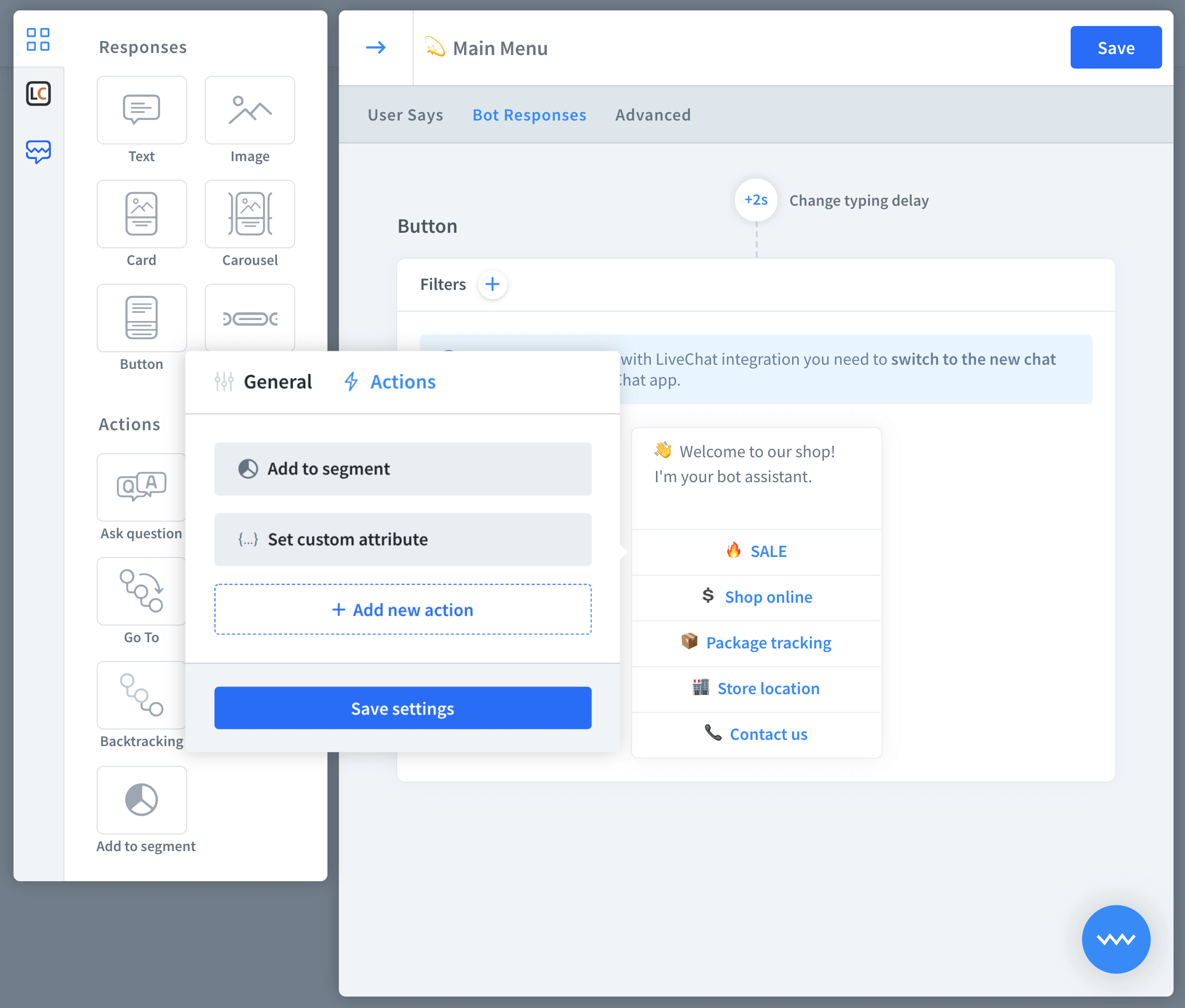 Click on add new action to see three available options:
-
Save to segment — adds users to selected segments.
-
Remove from segment ー removes users from selected segments.
-
Set an attribute ー assigns values to selected attributes.
Note that actions are optional so you can set more than one action to one button.
How to use button actions
Before we start, go to a draft story and add a new interaction with a bot response that contains buttons.
-
First, click the button to start the edit.
-
Now go to the actions section and click on add new action button.
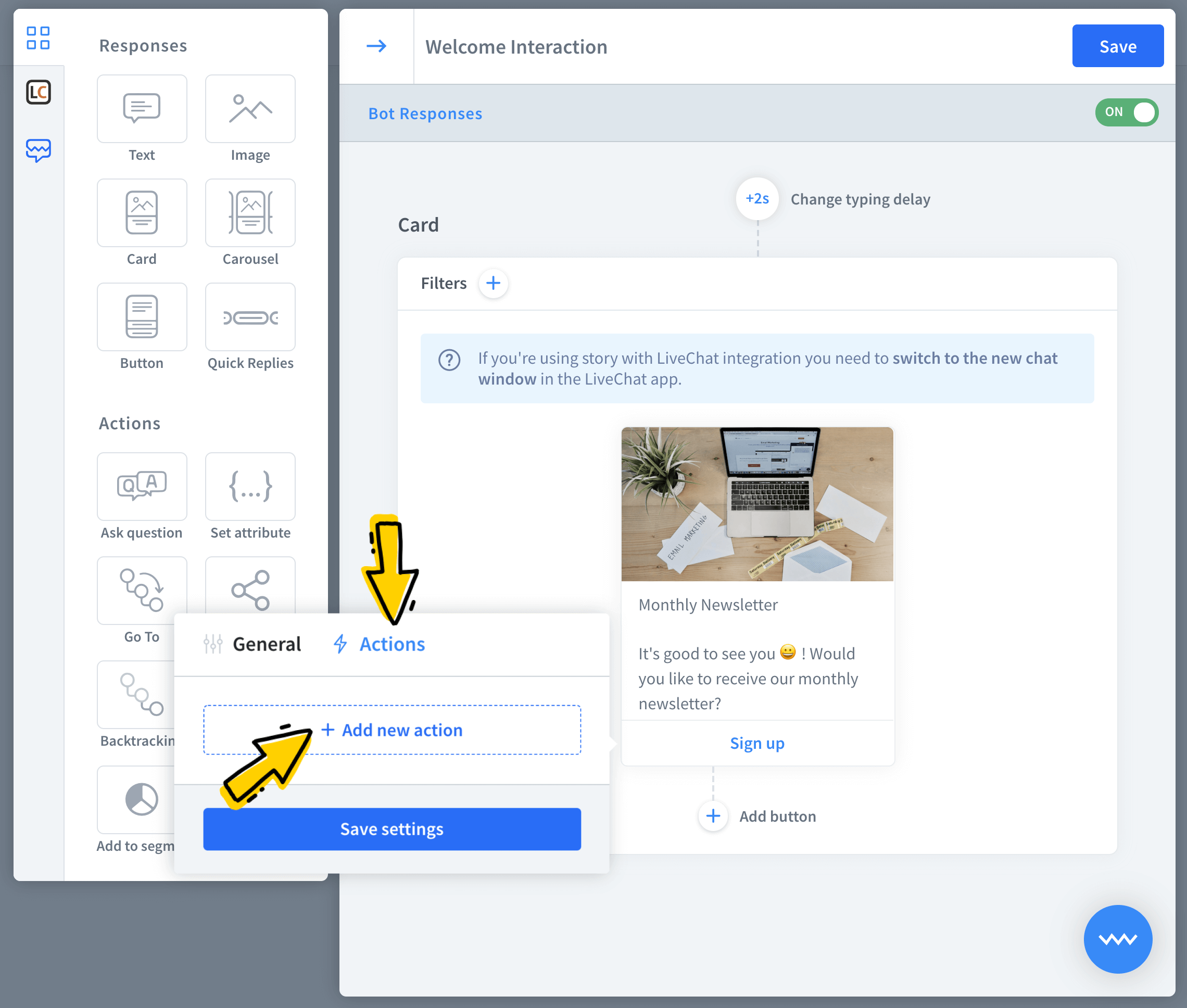
-
First, select the add to segment action.
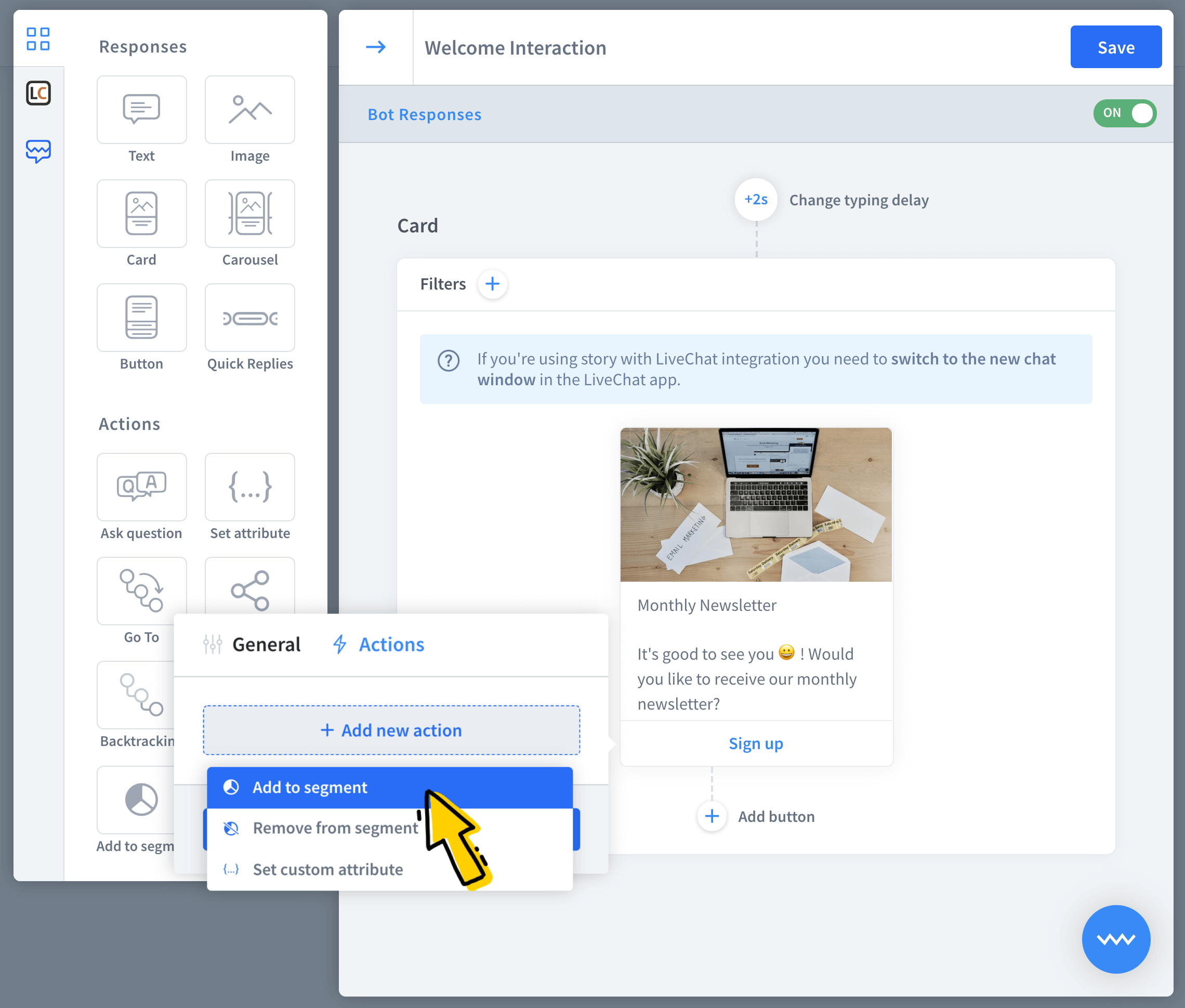
-
Pick the segment and save your changes.
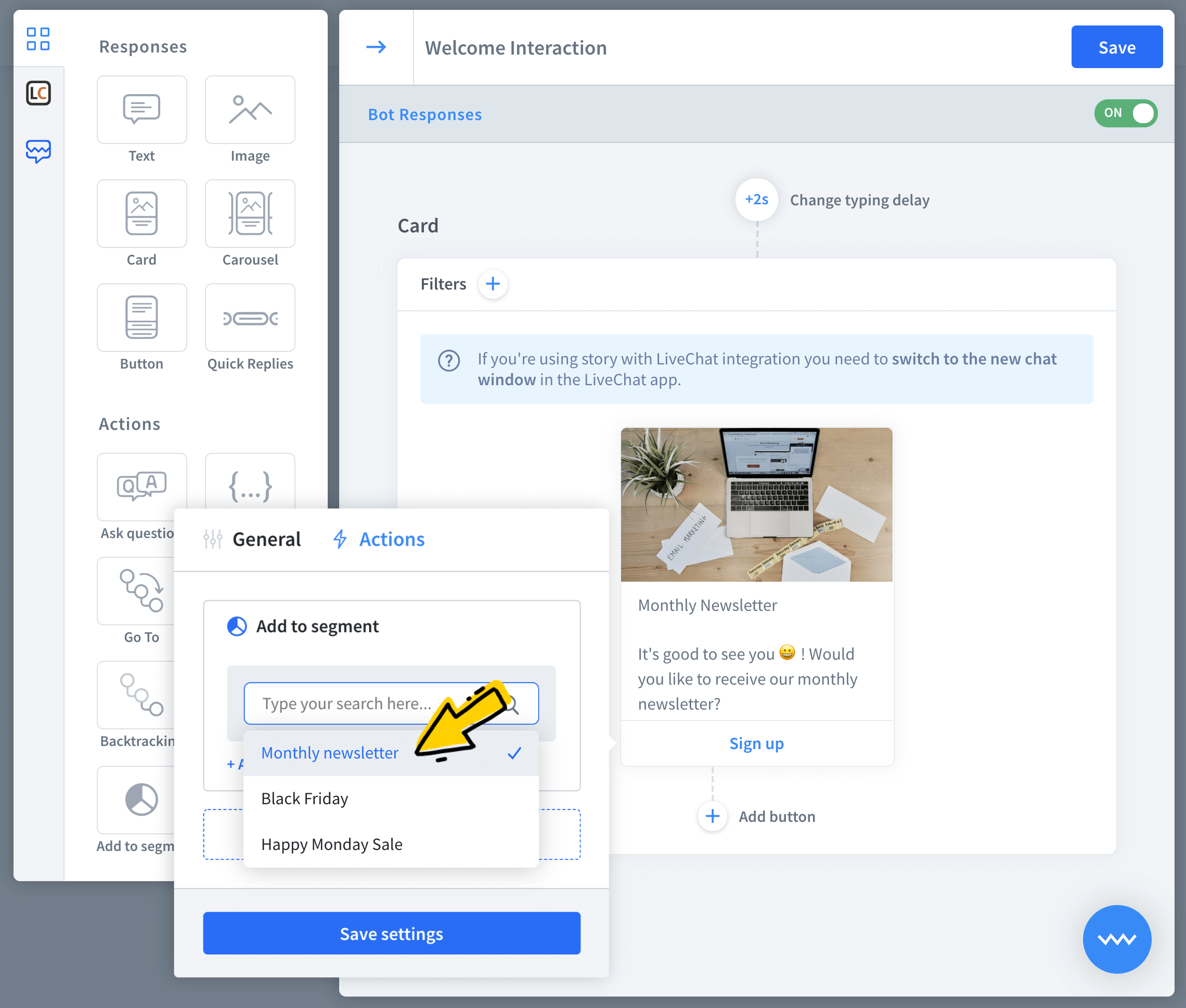
-
Your button with the action is ready. Similarly you can add attributes and remove users from segments.